Graphically speaking, ‘W’ is an interesting character to work with. Formed of two interlocking ‘V’s, the 23rd letter of the English alphabet is unique. It’s the only letter of the alphabet with three-syllables, which in turn do not represent its phonetic use. Last year here at Bell, we had the pleasure of developing three separate brands for Swindon Borough Council that all feature ‘W’ prominently.
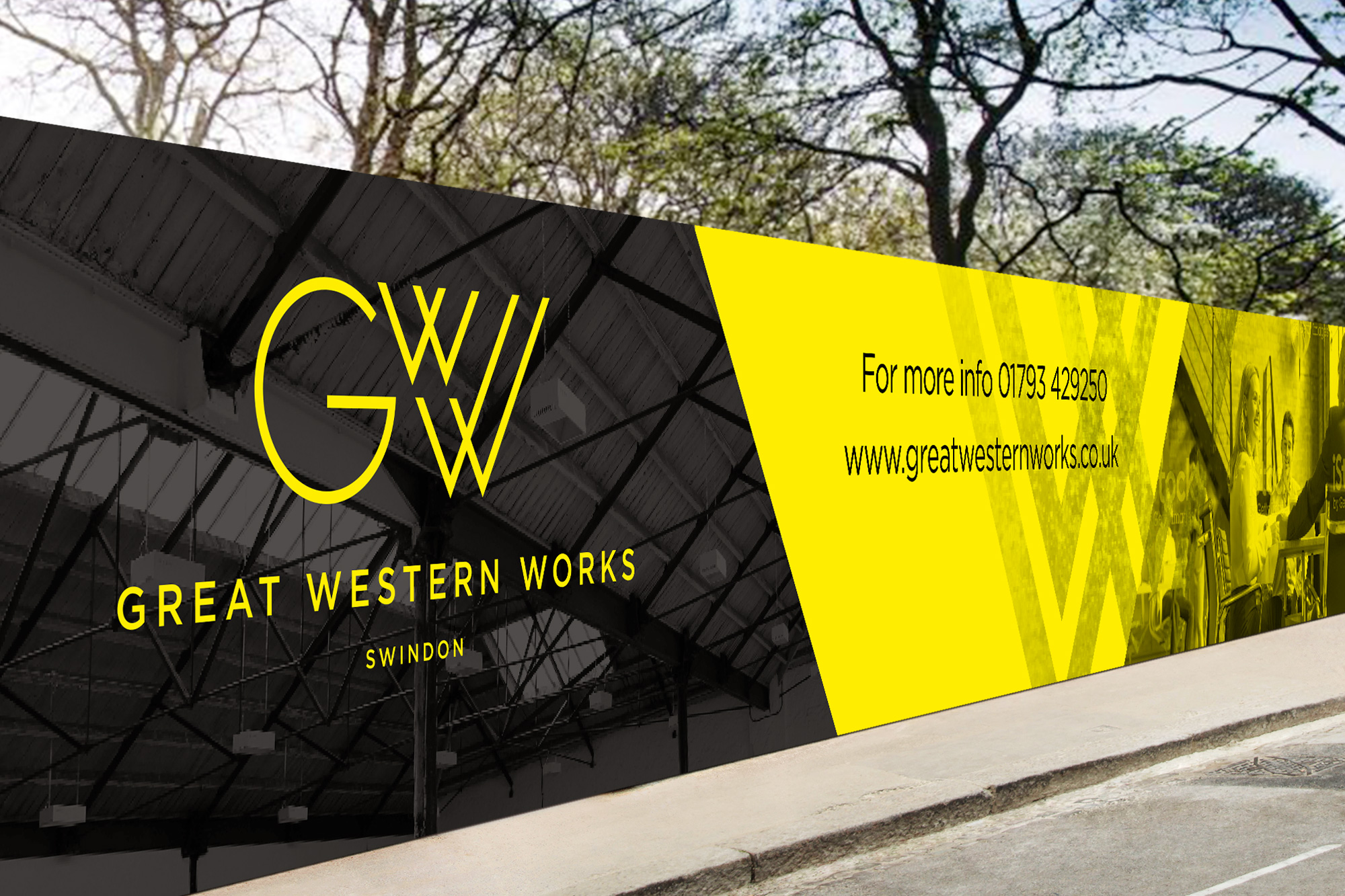
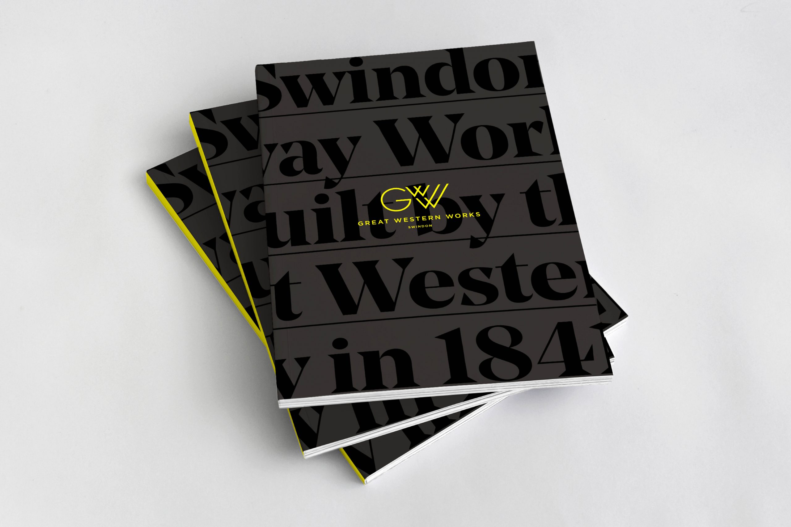
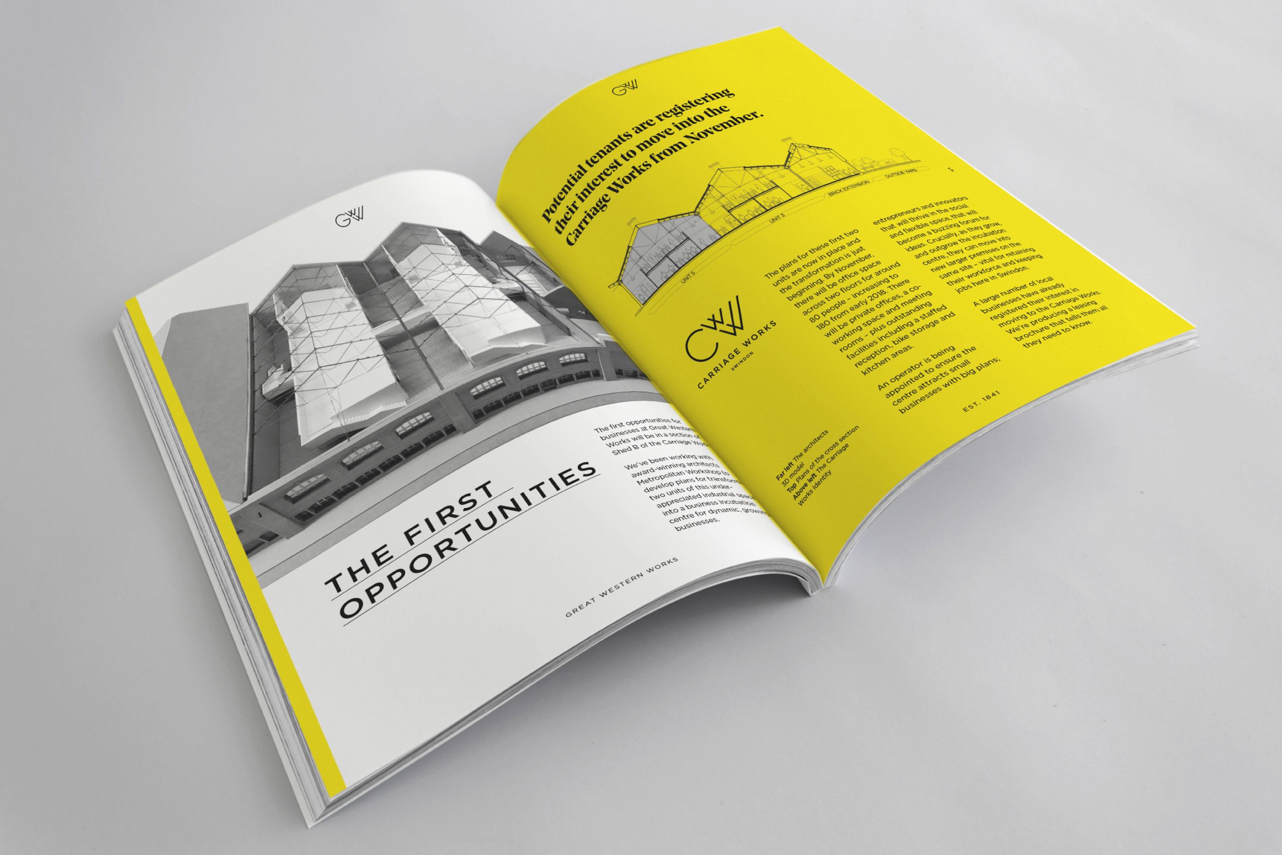
The first was a place brand for the Great Western Works (GWW), one of the largest regeneration projects west of London. We crafted an identity to both project a very contemporary feel and encapsulate its rich historic past. On the back of this came our second ‘W’ brand Carriage Works. A part of GWW, the Carriage Works buildings were originally built by Isambard Kingdom Brunel to assemble train carriages. With our help, Carriage Works is being brought back to life to offer historic, flexible, industrial workspaces for new businesses. This brand sits as a sub-brand under the GWW identity, with both identities sharing the common stylised ‘W’ we developed.
We also developed a place brand for Wichelstowe, our third ‘W’. Wichelstowe is made up of three villages: East, Middle and West, and when complete will have up to 4,500 homes; commercial premises; shops, a pub and restaurant; a community centre; and a secondary school. It will also have green public open space, including a country park, lakes and a newly built canal. For this exciting,ongoing project, we developed a ‘word mark’ with a highly crafted ‘W’ symbol, which will also be used as an environmental mark for wayfinding and street furniture. Of course, as dedicated designers, we love all the letters of the alphabet, but our current obsession with all things ‘W’ continues. We’re currently completing another ‘W’ brand for one of our clients. We can’t say much yet so watch this space, but let’s just say it’s located in West London!