Developing a robust brand for a changing higher education market
Newcastle University
After 2010, the English universities sector gradually transformed into a true market. In conjunction with this was the rise of degree apprenticeships and continuing professional development (CPD), as part of a push to both increase the vocational utility of universities and promote lifelong learning across the population. Degree apprenticeships are equivalent to Bachelor’s (Honours) and Master’s degrees, whereas CPD courses are shorter, and include some required qualifications for professions, such as dentistry.
Newcastle University, which already plays a leading role for the North East of England and beyond, plans to expand its presence in both Degree Apprenticeships and CPD in the next three years. Bell won a tender to provide detailed branding and visual identity work for this vital, growing Newcastle University provision. Included in this project were audience analysis and the development of unique personas, to cover a broad audience including potential students, university staff and partner businesses large and small. Due to the variety of audiences and information that needed to be conveyed, at different levels and different points of the conversion funnel, consistency and flexibility were key – consistency to present a unified brand impression, flexibility to communicate with specific audiences.
Our response
We began by developing a full brand model to provide the foundations for the project, and beyond, centred on a brand story and anchored by the proposition Empowering flourishing futures. We undertook audience analysis including detailed desk research and formulated nine personas, seven for potential/active students and two for partner employers.
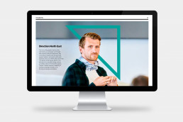
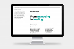
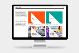
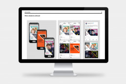
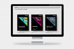
From this point, we developed a five-level messaging framework, one to work in concert with the overall Newcastle University brand messaging, another that conveyed ‘from before to after’, another using single word attributes, then messaging specific to personas and individual course offerings. From this platform, and utilising the Newcastle University we developed an arresting visual identity style highlighted by an arrowhead device that pointed North East and implied both forward and upward motion. The device could contain the single word messaging, be used as a holding device for other campaigns, or create a supporting pattern. We also developed a second supporting device that identified an offer as either an apprenticeship or a CPD course. Colours and typefaces were cut from the Newcastle University overarching guidelines.
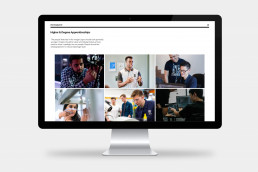
We also produced guidance for photography, and numerous example applications designed as templates, including A3 posters, A4 flyers, course brochures, roll-up banner stands, social media cards for Instagram, Facebook and Twitter, email and web page headers, PPT presentations and even course certificates. All were presented in an interactive 52-page brand guidelines, which also included tone of voice. We delivered this project in seven weeks from the initial scoping meeting.