Refreshing one of London’s oldest, most prestigious financial business brands
Smith & Williamson
Founded in 1881, Smith & Williamson (S&W) is a leading, global, independent provider of investment management, accountancy, tax, corporate and financial advisory services. Bell was asked to refresh their brand identity and provide them with guidelines to communicate this effectively both on and off-line.
Our response
The evolution of such an established, respected brand had to be handled with sensitivity. It was important that the Board was kept informed throughout the process to ensure their buy-in. Also, technical demands on the brand have changed almost beyond recognition and consideration for the digital application was a central focus at every stage. Their existing identity did not work online.
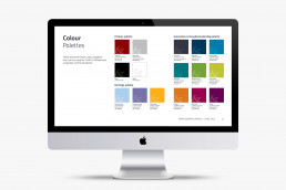
Having originally been briefed that the logo could not be touched we were able to show the Board how the logo could be developed without losing the brand heritage and brand equity. Our ‘stacked’ solution is subtle but a major leap forward for S&W, a solution they stuck with when undertaking their next, most recent brand refresh. In conjunction with these subtle changes to the logo, we made changes and additions to both colour palette and typography so that the identity worked equally well online, in print and in events and environmental applications.
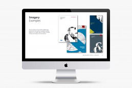
We utilised the ampersand from the existing identity and turned it into an integral part of the brand to increase recognition. The identity was then implemented across all channels, creating simple, intuitive, flexible design guidelines for global distribution.