
A new chapter begins
Reaching a half-century in this industry is quite the rarity, especially for an independent agency. As both witnesses to and players in the relentless, progressive transformation of the industry and the economy as a whole, we’ve seen fundamentals change and trends come and go, with many sticking. One constant has been the need for agencies such as ours, which is all the more reason to celebrate. We’re now 50, and as the saying goes, this is merely the end of the beginning. We’re excited to move into the next stage of the Bell story, new brand and all (more on that later).
Bell has always been an agile place. As much as we pride ourselves on craft and strategic thinking, we also approach everything with eyes and ears wide open. From our early adoption of in-house typesetting systems through to elevating digital marketing in the noughties, we’ve endeavoured to stay one step ahead; not to alter the fundamentals of what we do, but to augment them. Our merger with a digital marketing agency in 2017 added three new strings to our bow: PPC, SEO and Social. We also started our collaboration with our new sister agency in Paris, expanding our international operations. We don’t just change. We evolve.
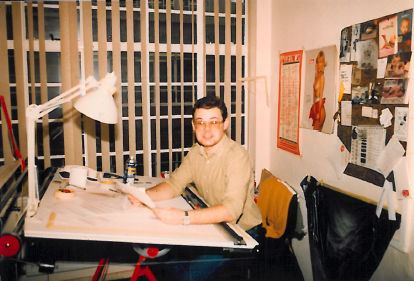
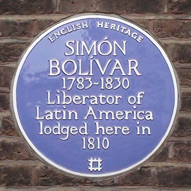
Founded in 1976 by Alan Bell in the final months of calm before the (then) hottest summer on record, Bell’s initial trio set up in a basement in Duke St W1, Marylebone. Which, as you could imagine, meant we were really hot from the get-go. Literally. It was a blue plaque building; Simón Bolívar “El Libertador” lodged here during the summer of 1810 (also a steamer, coincidentally). If 2026 (so far) is anything to go by, records are not what they used to be.
Of course, it was a different world back then. Sending out for bromides and Cromalin proofs. Long copy (sigh). Mark-ups by hand on the boards. Manual leading, kerning and tracking. This mostly analogue world was just as intense as it is today, albeit broken up by a long-lost, legendary lunch culture. Our first serious Apple Macs came in 1989; the II FX with an almost comically small (by today’s standards) 16mb of RAM. Two of them, for an equally comical cost of £20K.
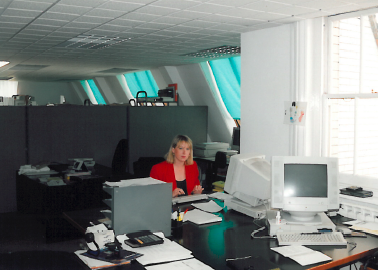
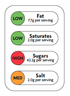
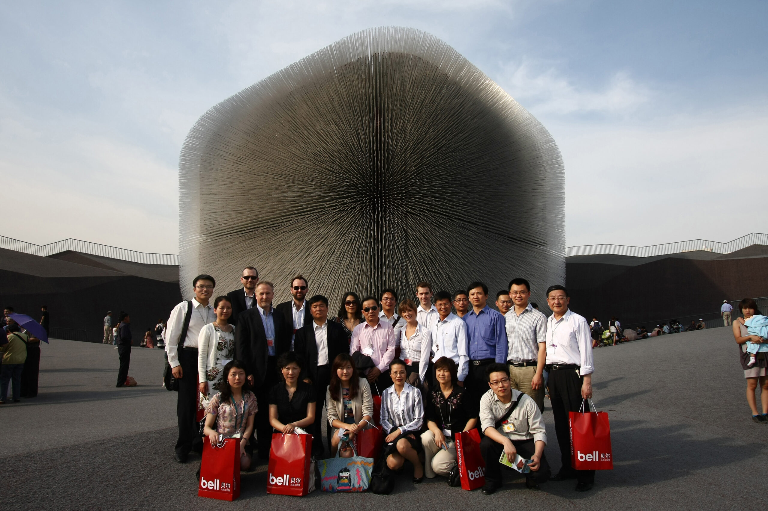
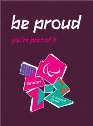
Selecting from a prolific fifty-year portfolio is no small task. Standouts include creating the ‘Traffic Light’ label you see on every packaged food product in the UK for the Food Standards Agency, for whom we recently completed their twenty-fifth Annual Report and Accounts (we also delivered their first one way back in 2001). Representing the UK design industry at the Shanghai Expo 2010 is definitely up there, as is working on the 2012 London Olympics, for whom we created a three-year health and safety campaign.
Sometimes, it was just too perfect. Such as when, in 1997, our receptionist ventured behind the velvet rope to say, “There’s someone in reception from a cab company who wants us to design a logo.” Six months later, we had rebranded Radio Taxis and their 3,000 London black cabs.

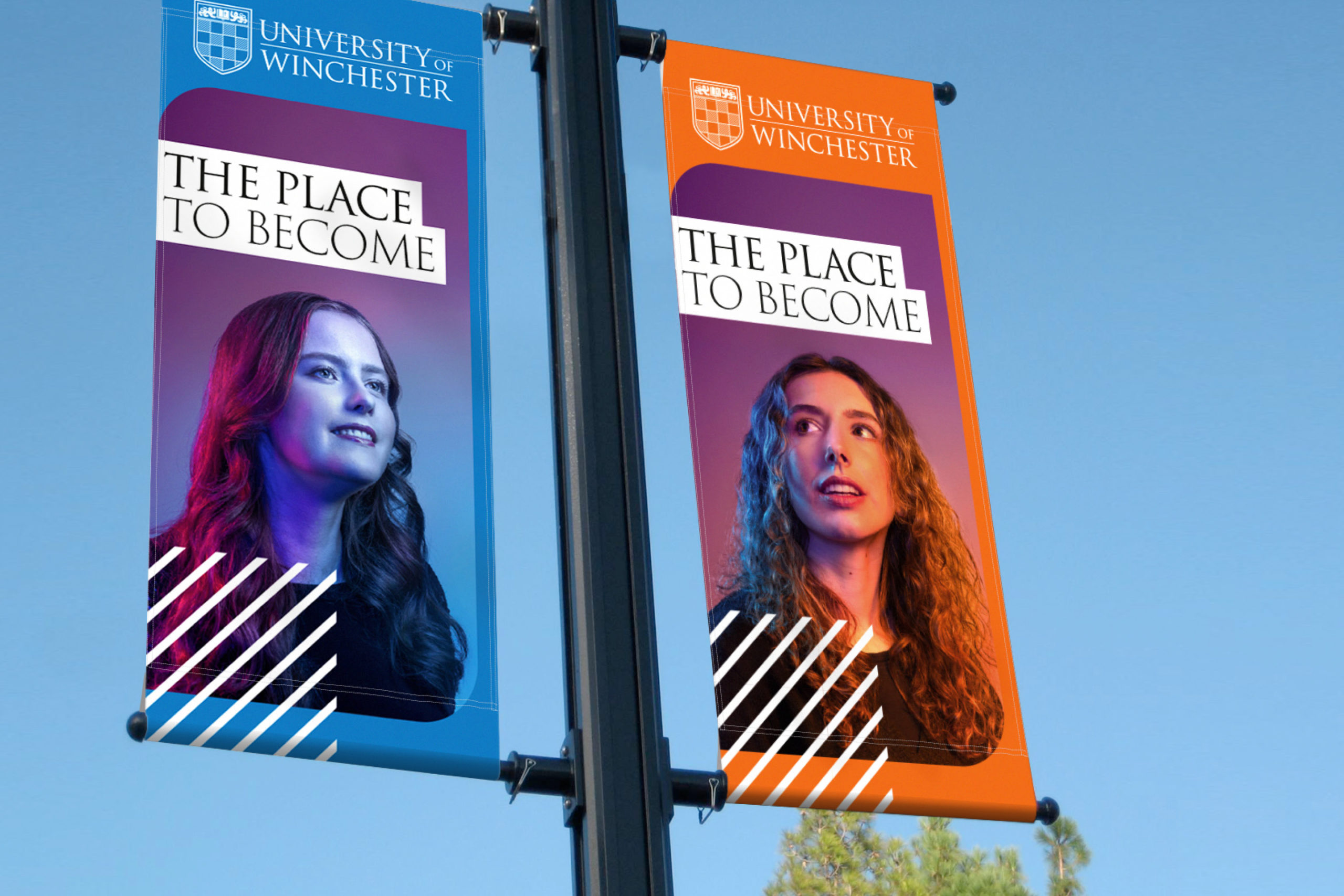
More recently, we’re proud to have played a part in changing the way universities are branded and marketed, starting with our multi-award-winning recruitment campaigns for the University of Reading and continuing with our work on the University of Winchester rebrand. Topping the GIPHY charts in “clearing” and “results day” for the UoWoW campaign, when universities across the country were all over the platform, was another highlight (ranking aside, getting over 2.3 million views was mighty cool).
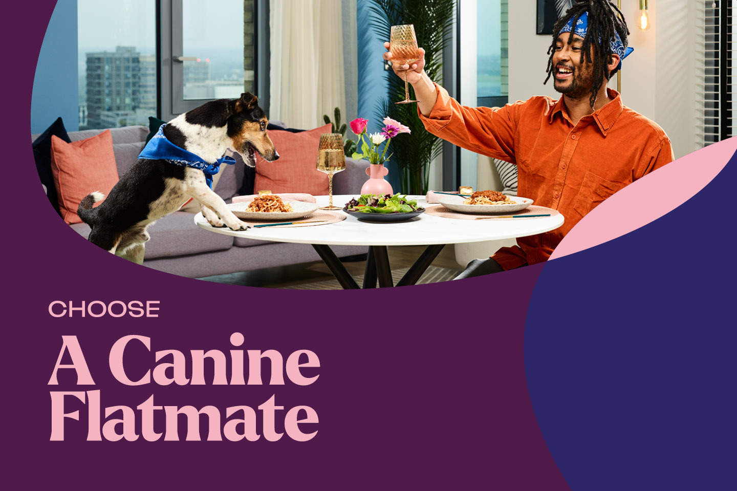
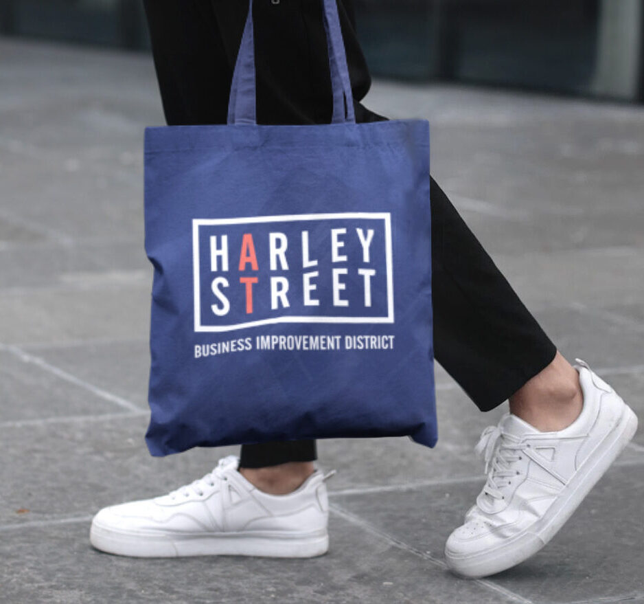
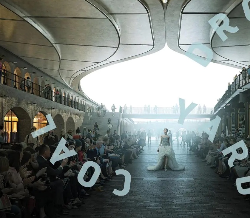
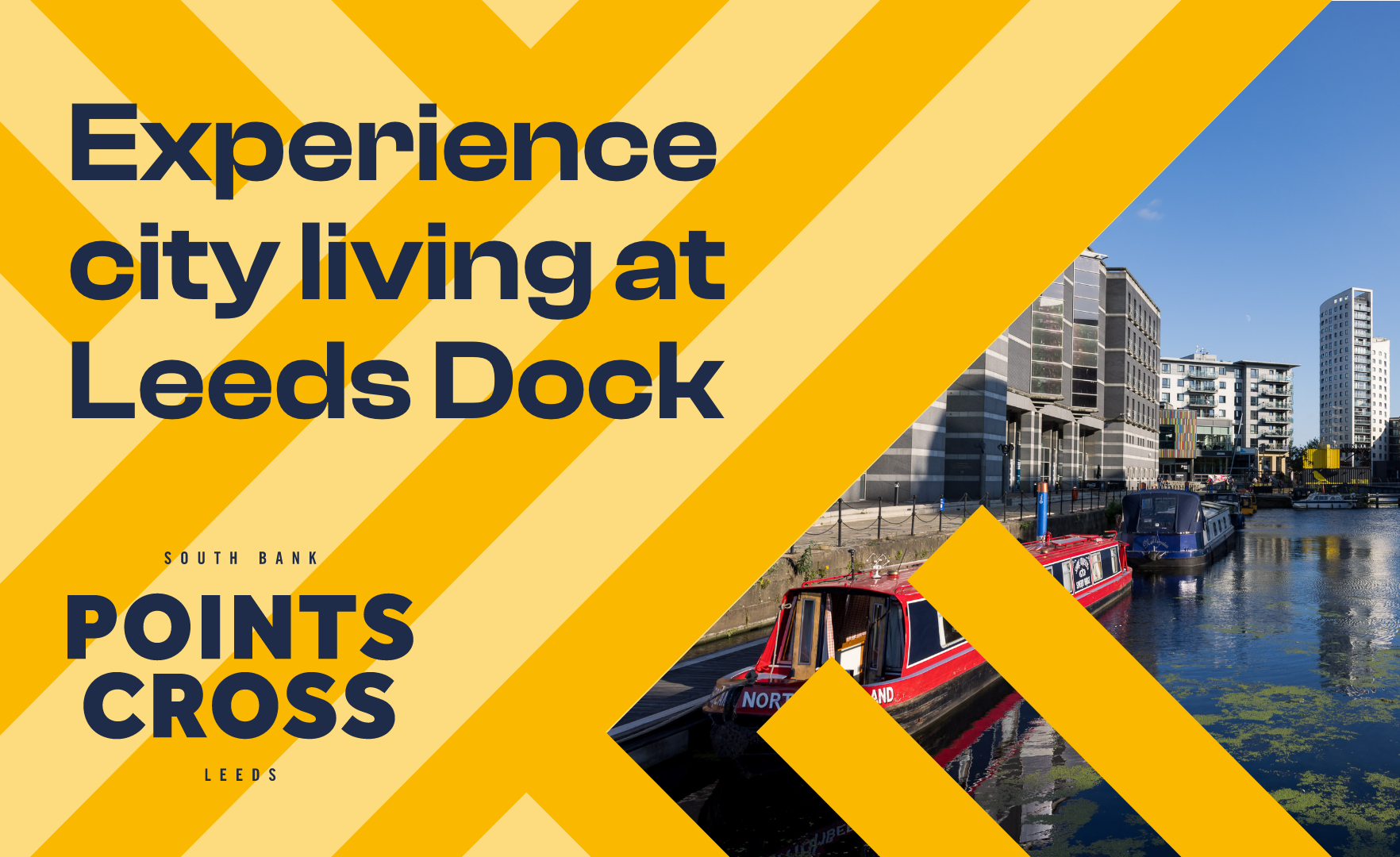
Having worked with 9 of the 11 members of the G15 housing associations is up there, too. One of those members is NHG Homes, with whom we’re in the midst of a major advertising campaign (our largest ever). You may have seen around town the numerous scenes from life depicted in our campaign: maybe a kitchen disco, urban jungle or a dog and owner sharing a meal (if you’re wondering, the good boy’s name is Rebel and he stole the show at the photoshoot). Incorporating ‘place’ into property more and more is also worth noting, with Points Cross in Leeds (Guinness Homes’ flagship development) being a great example. Working on the King’s Cross redevelopment and developing the award-winning Harley Street Business Improvement District brand have also been highlights.
We’ve always loved bold, out-there creative, and are as likely to leap into the air when we nail it as any agency out there. However, at Bell, effectiveness has always taken priority. As Alan once said, “Doesn’t matter how beautiful or radical it looks, if it doesn’t get results, it’s not good creative”. This is how effectiveness awards became our thing, and we’re super proud of our 18 wins in the last 15 years at the Transform Awards Europe.
Our Managing Director, Bruno Alberini, says:
“We’d like to extend a huge thank you to all our staff, clients, partners and suppliers who helped make these 50 years so special, and we look forward to embracing the opportunities ahead and continuing our journey together”.
To celebrate 50 years, and to position Bell to best respond to the challenges of the future, we have reimagined our brand, including a new visual identity and website. It encapsulates who we are, what we offer, and how we will fit in and contribute to clients and the sector going forward. Built on our robust foundations, it’s ideal for us in the super-fast-moving environment in which brands and audiences co-exist today. With our inquisitive minds, love of craft and the search to find and convey meaning, we’re all in on the future, but will always remain powered by people.
Bell
Turning headssince 1976
We’re proud of the ideas, partnerships, and bold thinking that have shaped our first 50 years in business. Here’s to continuing to create inspiring work that truly makes a difference.

Related posts

Reimagining our brand identity for a new era
We’ve refreshed our Bell brand identity to encapsulate who we are, what we…

Introducing Deptford Edge
Check out Bell's work on Peabody's new residential development in Deptford.


ParkSide comes to life
Check out Bell's work on NHG Homes' new collection of 1, 2 & 3 bed apartments…