
Introducing our new brand identity
We’re celebrating our 50th anniversary this year in a branding and marketing landscape that continues to evolve at a great pace. What better time to take a deep dive and refresh our brand! The result: a new Bell. Hitting the half-century mark may have been a catalyst, but it wasn’t the true inspiration for this project. We’ve also evolved, so our brand positioning and identity needed to as well. We need to present an accurate picture of who we are, what we offer, and how we do things, now and into the future, that conveys how we will fit in and contribute to clients and the sector. A proper window into our values, personality and aspirations, and a stronger match for a super-fast-moving environment in which brands and audiences co-exist today.
This is why we focused on the concept of ‘fluidity’, developing a brand ‘in motion’. Conveying movement in line with our agency as we begin the next phase of our journey as a boutique independent agency in London and Paris. We may be an agency on the move, but our foundations are solid. As forward-looking as we’ve become, we remain inquisitive, imaginative, head-over-heels for craft, and forever searching for meaning and value in everything we do. We’re all in on the future, but will always remain powered by people.
Our Creative Director, Jason Bannister, highlights:
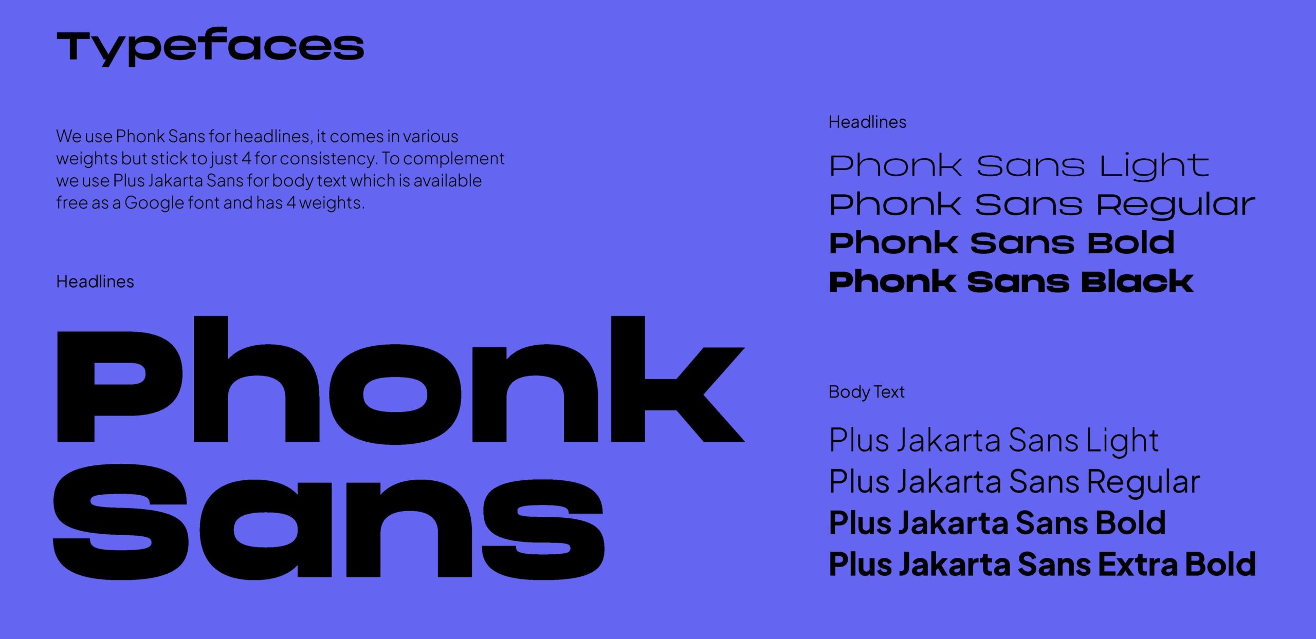
“You can see it in the extended grotesque typeface we chose for headlines. It has a strong, confident feel; at once unapologetically modern and with a timeless elegance. With 10 dynamic weights and matching italics, it offers us exceptional versatility across the board. We paired it with Plus Jakarta Sans, which, although sharing a geometric foundation, acts as a counterweight in our overall visual hierarchy. It is a textbook ‘display and text’ partnership that balances loud, artistic styling with effortless, clean readability”.
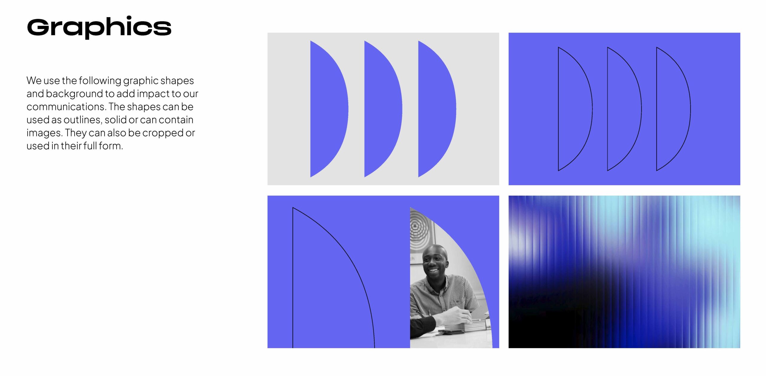
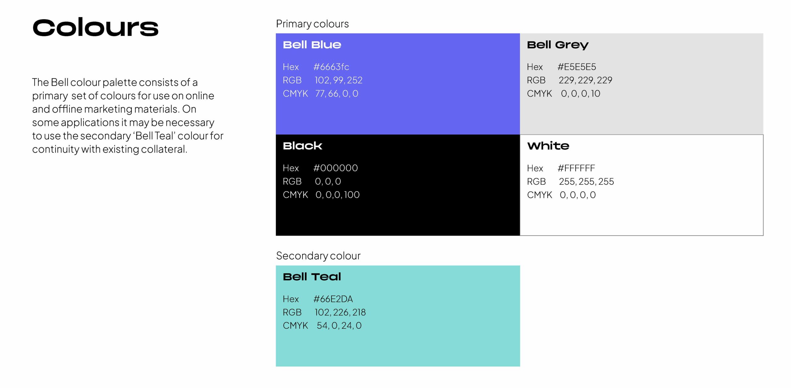
You can also see it in our choice of colour palette. Modern and minimal, and yet strikingly bold; violet with a blue tinge that evokes associations with imagination, wisdom and energy on the one hand, and passion, drive and daring on the other. We’ve enhanced our palette with simple geometric shapes, created from the inner “b” of the new Bell logo, that can be used as outlines, solids, or to frame imagery. We’ve also introduced a frosted glass effect that implies that something intriguing is taking place on the other side, which will be revealed once you pass through. Our visual brand elements convey much of what we want for our clients: dynamism and movement, with a clear, consistent sense of purpose.
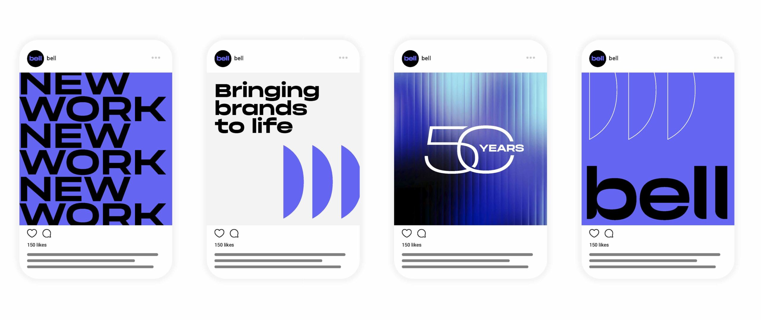
We’ve carried this into our key messaging, based on our core proposition: Elevating brands. Energising creative. This is our statement of intent: developing, refreshing or reimagining on the brand side, and everything a client could need when it comes to creative. Beyond our outputs, we hope it captures the essence of what it feels like to work in partnership with us, on branding, creative, digital marketing, or all three. As a team, we’re fast, flexible and super easy to deal with, and we prioritise effective relationships. It also helps that we find everything interesting. We love what we do, and all projects, no matter what size, budget or sector, are equally important to us.
As it has been for 50 years.
Reaching our half-century gave us the perfect opportunity to rethink how we look, express ourselves, and represent who we are. Our new brand is the result. An honest reflection of our values, approach, and the relationships that define us. Welcome to the next chapter of our story.
Bell
Turning headssince 1976
We’re proud of the ideas, partnerships, and bold thinking that have shaped our first 50 years in business. Here’s to continuing to create inspiring work that truly makes a difference.

Related posts


Introducing Deptford Edge
Check out Bell's work on Peabody's new residential development in Deptford.

ParkSide comes to life
Check out Bell's work on NHG Homes' new collection of 1, 2 & 3 bed apartments…