

Elevating the experiences of student accommodation
Every Student – Branding
The UK’s purpose-built student accommodation sector (PBSA) has seen steady growth since 2012, with over a quarter of a million new beds added across the country. However, the branding and marketing for the players in the sector is features-led and relatively ‘corporate’ and generic – for many, the only part that distinguishes them from others is a logo. Most competitors focus on ‘what they do’, not on how they make their student residents feel.
Every Student is a growing player in the sector, with properties in three cities and big expansion plans. Although their existing brand was certainly bold, they found themselves positioned as an affordable option in the PBSA. They commissioned Bell for a brand audit and refresh to help them stand out in a highly competitive sector, and to help drive more enquiries and bookings.
Elevating the experiences of student accommodation
Every Student – Branding
The UK’s purpose-built student accommodation sector (PBSA) has seen steady growth since 2012, with over a quarter of a million new beds added across the country. However, the branding and marketing for the players in the sector is features-led and relatively ‘corporate’ and generic – for many, the only part that distinguishes them from others is a logo. Most competitors focus on ‘what they do’, not on how they make their student residents feel.
Every Student is a growing player in the sector, with properties in three cities and big expansion plans. Although their existing brand was certainly bold, they found themselves positioned as an affordable option in the PBSA. They commissioned Bell for a brand audit and refresh to help them stand out in a highly competitive sector, and to help drive more enquiries and bookings.
Our response
We had to find a delicate balance between affordability and value for money with aspiration, shared values, quality of life and experiences. We began by writing a brand story, highlighted by the core positioning statement “Experiences for Life”.
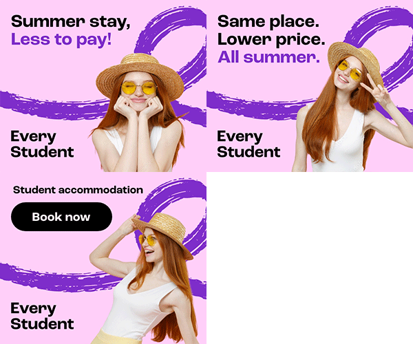
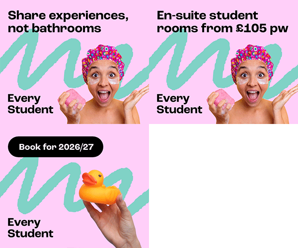
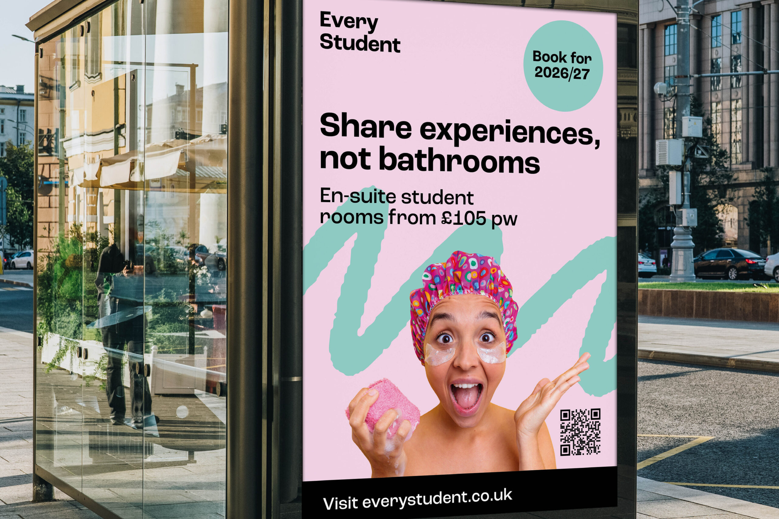
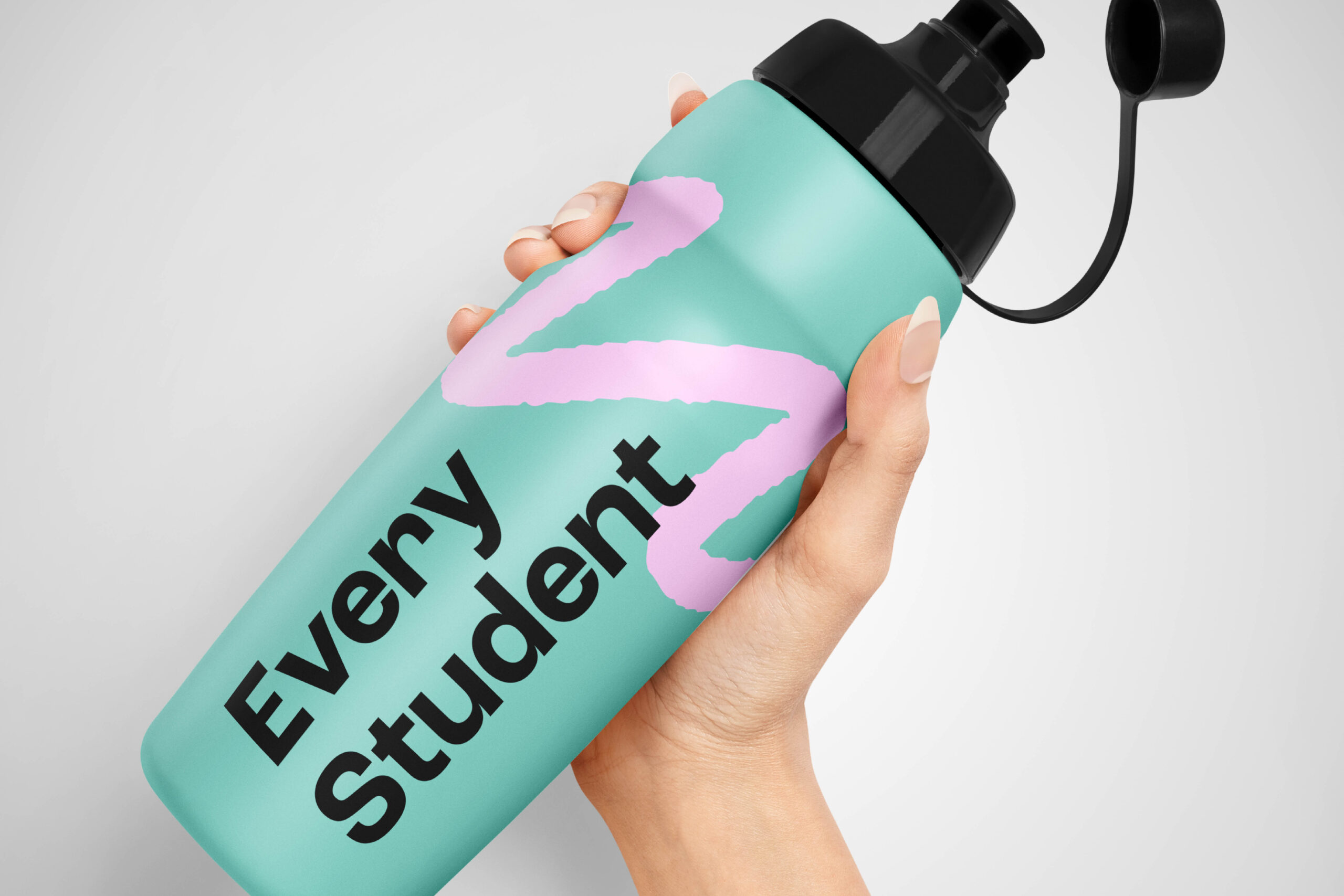
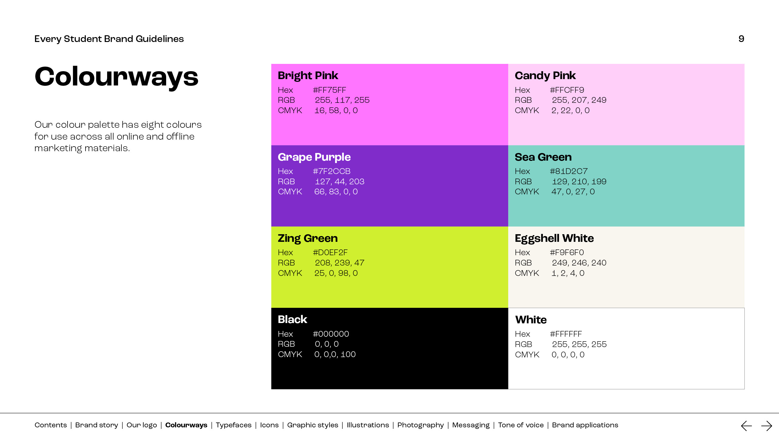
For the brand look and feel, we were inspired by elements of the visual language of Gen Z, embracing visual boldness and interactivity, yet notable for its simplicity and accessibility. Our style was driven by a fusion of digital artwork and hand-drawn doodles, from which we incorporated textures. We expanded their colour palette to mix bold and softer colours to appeal to a broader demographic. We incorporated more people in materials to better convey experiences, emotions and a sense of connection (as well as a human side).
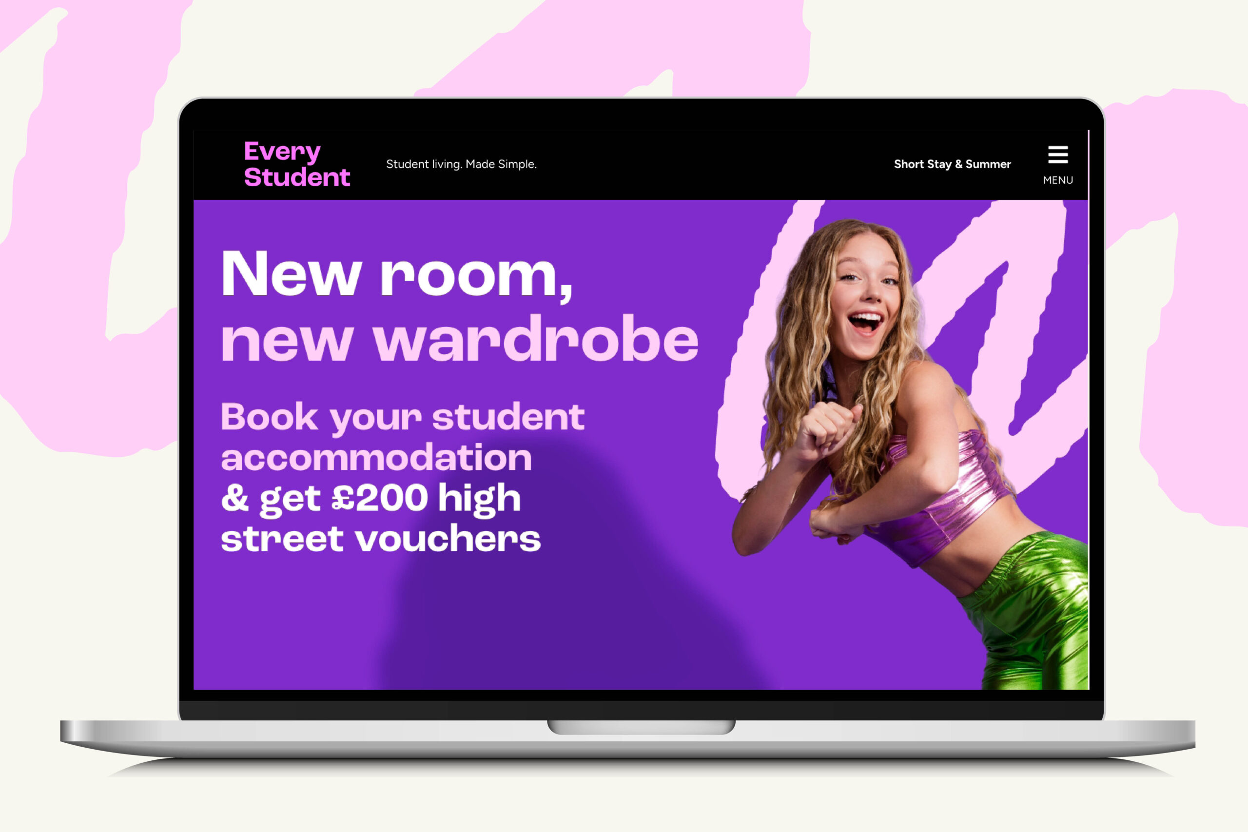
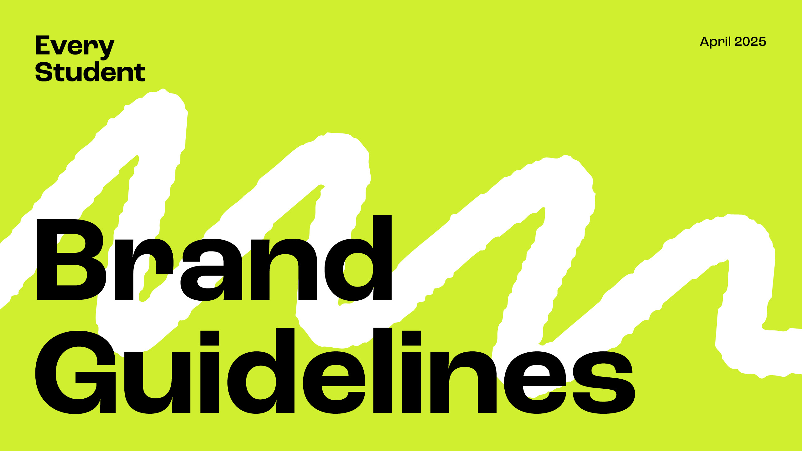
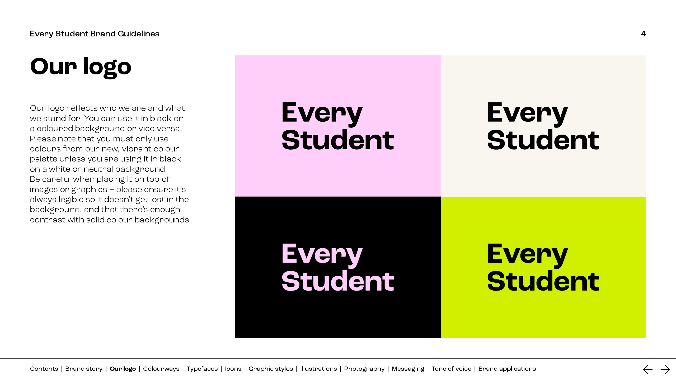
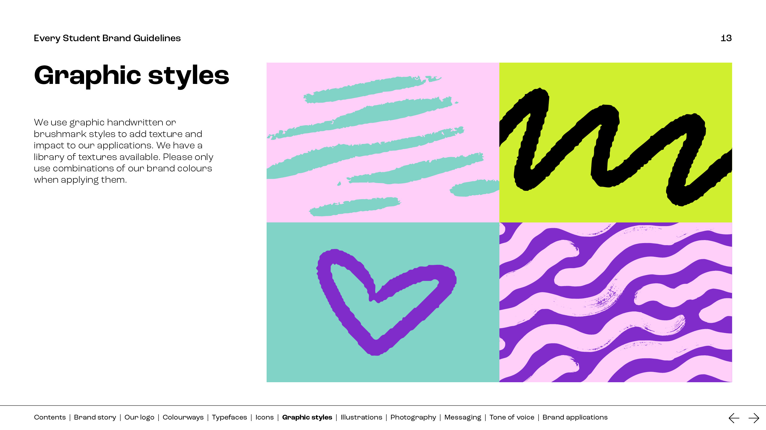
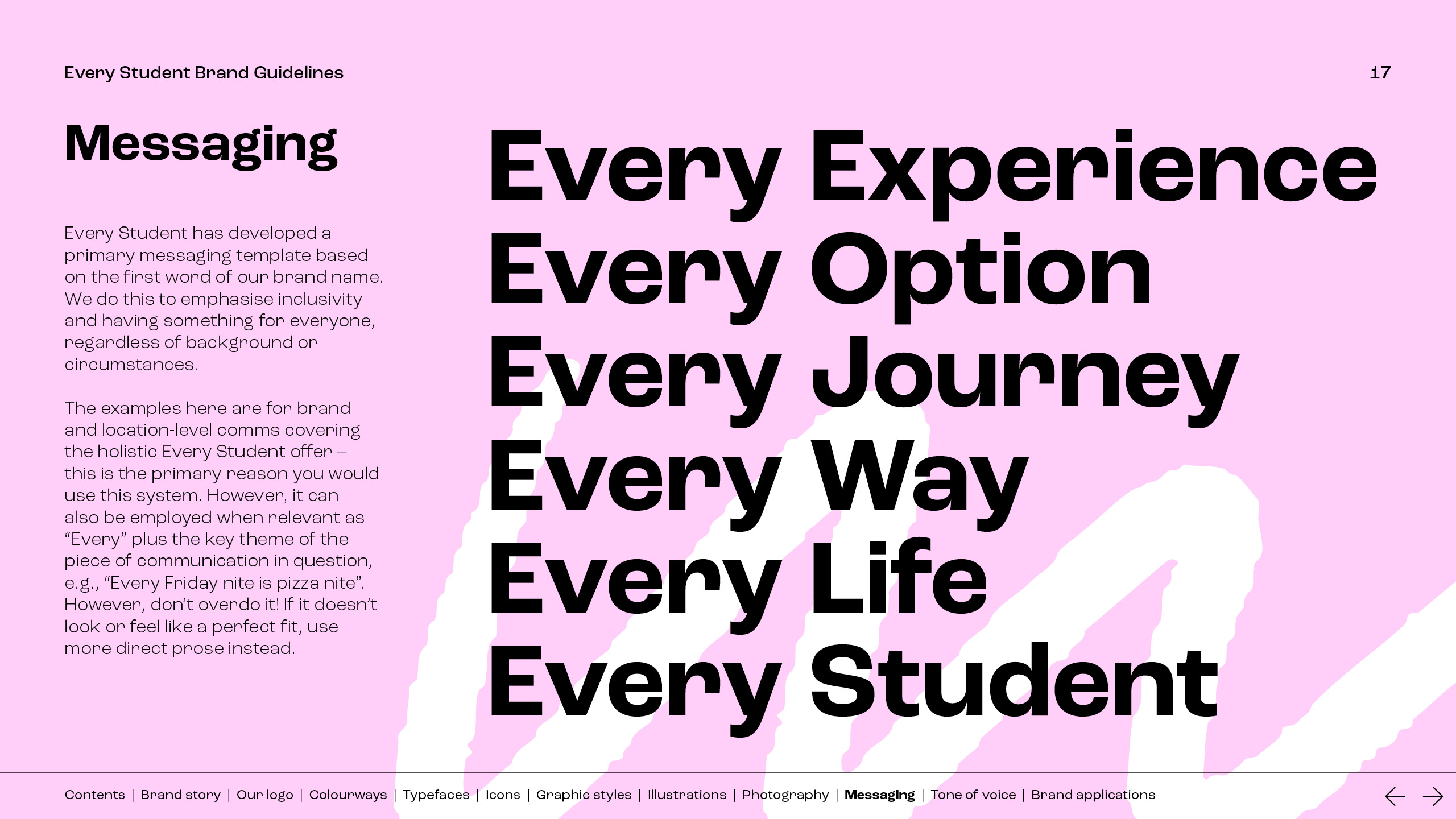
We developed a messaging framework based on Every – such as Every Connection, Every Discovery, etc, and tone of voice guidance. Applications included stationery, a PPT template, merchandise, emails and printed DM. We delivered interactive brand guidelines, a toolkit for internal use and key visuals. The new visual identity came to life through the campaigns we delivered, including incentive, clearing, re-booker and summer campaigns.